Introductory Guide to Explorations in GA4
Google Analytics 4’s exploration reports make analyzing data very intuitive and flexible. It provides free-hand to take any (valid) combination of dimensions and metrics and use them in the visualization of our choice. This is in contrast to standard reports which have fixed dimensions and visualization types. With flexibility, comes the complexity of the interface. To make it simpler to understand and get a comprehensive grip on the tool, I will break down the “Explore” concept into a series of articles. This article will focus on a beginner’s introduction. We will understand the key terms used and how to navigate the interface. In future articles, we will follow on hands-on usage of the tool to make data-driven decisions.
Key Section in Explore
There are 3 key sections in Explore reporting. Each key section then contains further options. Please note that this categorization in 3 key sections is arbitrary. The intention is to understand the navigation by breaking it down into smaller parts.
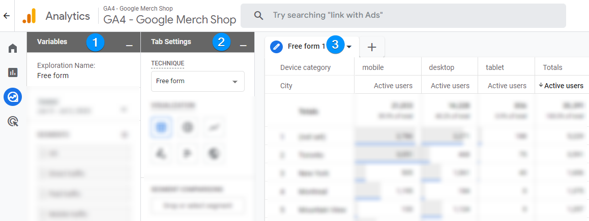
There are 3 key sections in GA4 Explore reporting as annotated in the picture above.
- Variables
- Tab Settings
- Tabs (space for visualizations)
We will go through each one of them and look into what options and features they offer.
Variables in Explore
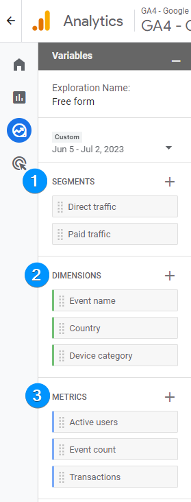
The variable section provides an interface for selecting any combination of dimensions and metrics. You can then choose a particular segment (subset) of the data by selecting segments.
Dimensions in Explore
Dimensions are essentially a way to categorize and organize data points for understanding. For example, categories like the geographical location of the user, the type of browser being used, the device type (like mobile or desktop), or the source from which the user came to your site (like organic search, social media, direct traffic, etc).
Importing Dimensions
By default, the Variable section in Explore will not have any dimensions. The dimension will need to be imported. This is in contrast to standard reporting where you are given a chart with existing dimensions and some values. To import the dimensions, click on the + button. This will open the dimension import panel. Dimensions are organized into accordion/categories. Expanding dimension categories will let you see and import the dimension.

To import the dimension, expand the category and select the dimension you are after.

Once you have clicked the import button, dimensions will appear in the Variables -> Dimension section.
Metrics in Explore
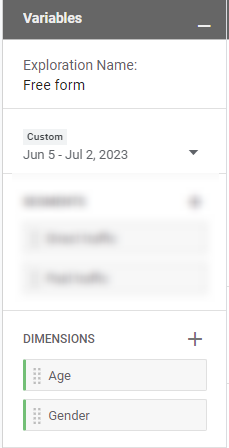
Metrics provide the numbers required for understanding the information categorized by Dimensions. For example total no. of page views, total session duration, transaction amount etc.
Importing metrics is exactly same as importing dimensions above. The only difference is that imported metrics show up under Variables -> Metrics heading.
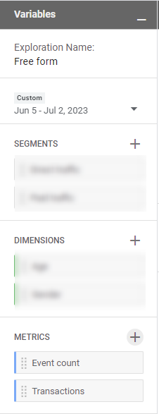
Segments in Explore
Segments help you focus on specific parts of your data – like users from a certain city, or visitors who made a purchase. Segments let you zoom into these details, and make it easier for you to understand how different groups of users interact with your website.
Adding segments is slightly different than importing dimensions and metrics. Clicking on the + icon next to the segment heading will open the Segment Building interface. There are two further sections in the segment-building interface.
- Create a custom segment: Start from scratch
- Use a reference: Build upon an existing template from either General, shopping, templates or predictive.
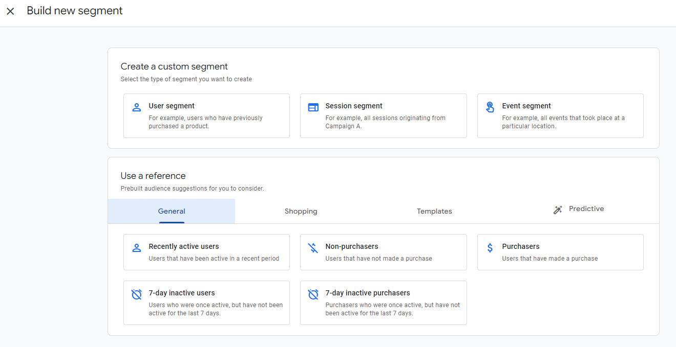
User segment
A user in GA4 represents an individual who has interacted with your website or app. Each user is identified by a unique ID, allowing GA4 to track the number of unique visitors your website or app receives.A segment based on user would allow you to choose a subset of users.
Session Segment
Sessions are periods of active engagement that a user spends on your website or app. This could include browsing different pages, adding items to a shopping cart, or interacting with content. A segment based on sessions would provide you with a subset of data where your defined session activities have occurred.
Event Segment
Events are specific interactions or activities that happen within a session. This could be anything from clicking a button, completing a form, making a purchase, to even just scrolling on a page. A segment based on events would give you a subset of data where your selected events have occurred.
Once you build a segment it will be added under the Variables > Segments section.
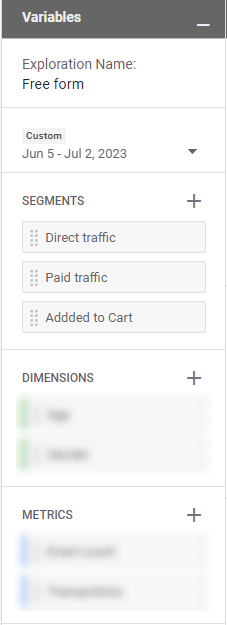
Tab settings in Explore
Tab settings provide a few options which are like the control center of your report, allowing you to select various parameters and tweak the output to match your analytical needs. We will go through the tab settings one by one to make it easier to understand.
Techniques
The Techniques feature in GA4 Explore enables you to choose how you want to display and analyze your data. You might use a simple technique like “Exploration,” or more advanced ones like “Funnel Analysis” or “Cohort Analysis” depending on what you’re looking to understand. The techniques supported by GA4 Explore are :
A. Free-form
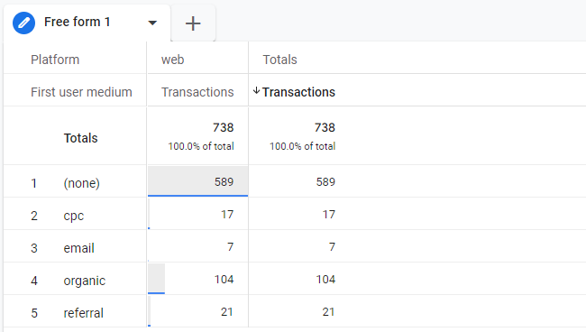
Free form as the name suggests, gives you a completely free hand. One way of thinking about free-form would be that it employs no technique objective at all (all the other techniques have certain analysis objectives). It allows you to do a tabular view(cross-tab) and other visualization methods such as bar graphs, circle graphs, line diagrams, scatter charts, and geographical maps. etc
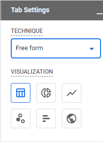
A simple example of cross-tab free form is given below.
B. Cohort Exploration
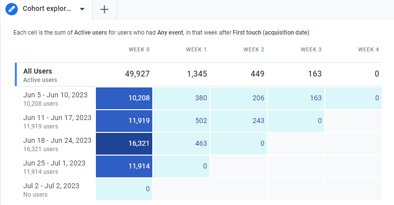
A cohort is a synonym for a group of users. This reporting technique understands the patterns and performance of user groups linked by shared characteristics. Cohorts are based on the user’s device data (cookie data) only. User-ID is not considered when creating a cohort.
C. Funnel Exploration
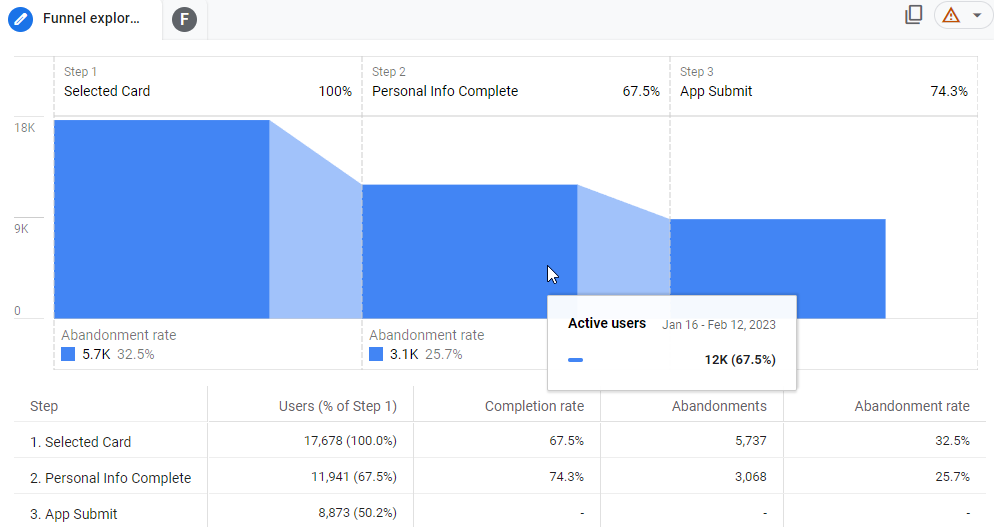
Funnel gives a visual representation of the steps users follow to accomplish tasks on your website or application. This helps in understanding step-by-step customer or event journey. For example, if we were interested in the user’s journey after their payment method ( card ) selection, we could create a funnel based on the following steps.
- Selected card
- Completed personal info
- Submitted App
D. Segment overlap
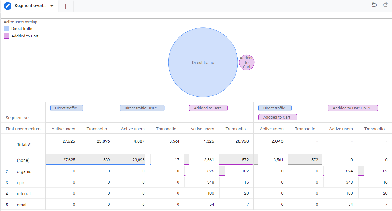
This report focuses on how distinct user segments intersect. For example, if you want to see the relative proportion of direct traffic users who added any product to the cart, you can overlap those segments to get the results below.
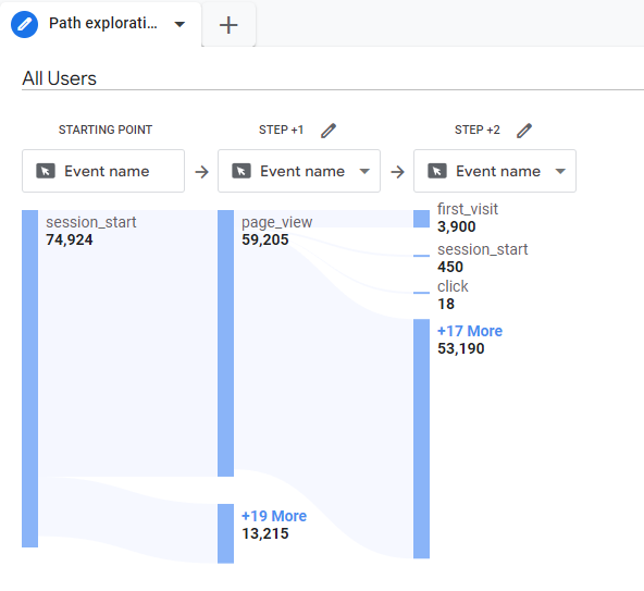
E. Path exploration
Get a graphical representation of the routes your users follow when they engage with your website or application.
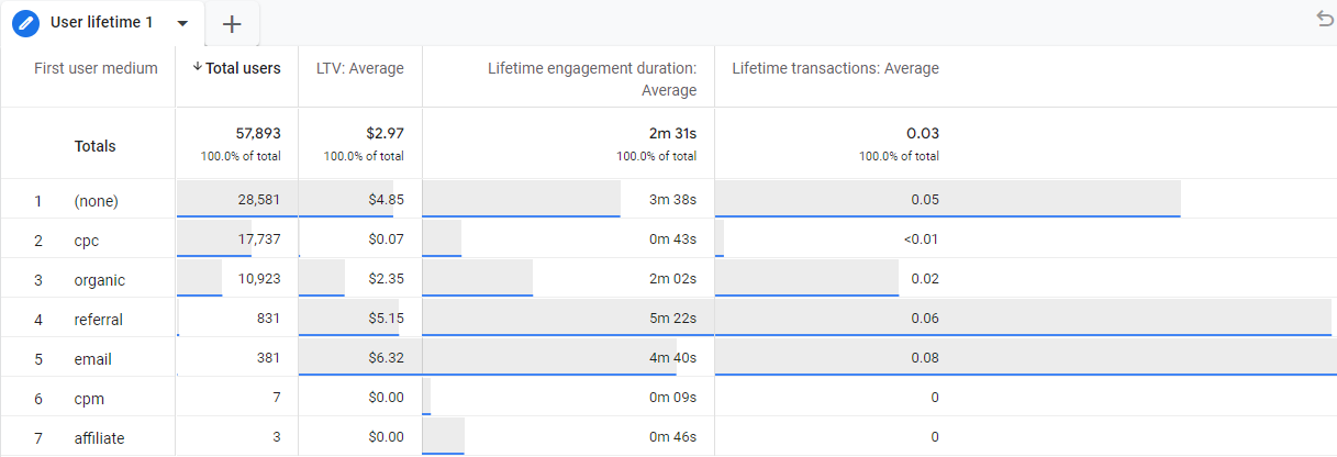
F. User lifetime
This technique supports only cross-tab(tabular) visualization. It lets you view users’ lifetime averages. An example of users’ lifetime report would be one given below.
Visualization settings
Each technique supports a few visualizations. Settings specific to each visualization are beyond the scope of this article. In other articles under the analysis section, we will go through each of visualization by considering practical business use cases for making data-driven business decisions. For a high level of understanding, it’s helpful to understand visualizations supported by techniques, given at the end.
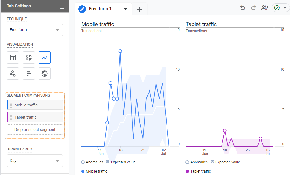
Segment Comparisons
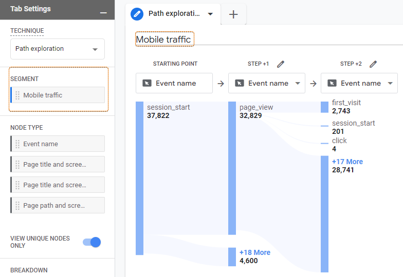
Segment comparisons help you by selecting a subset of data based on the segment definitions. With this setting, you can compare different segments (like users from different countries, or sessions that resulted in purchases) side by side. All techniques other than Path Exploration provide the option to compare segments. Path Exploration provides support for single-segment selection though to analyze path of a subset of users ( segment ).
A path exploration technique is the only technique that does not support segment comparison. Instead, it supports a single segment.
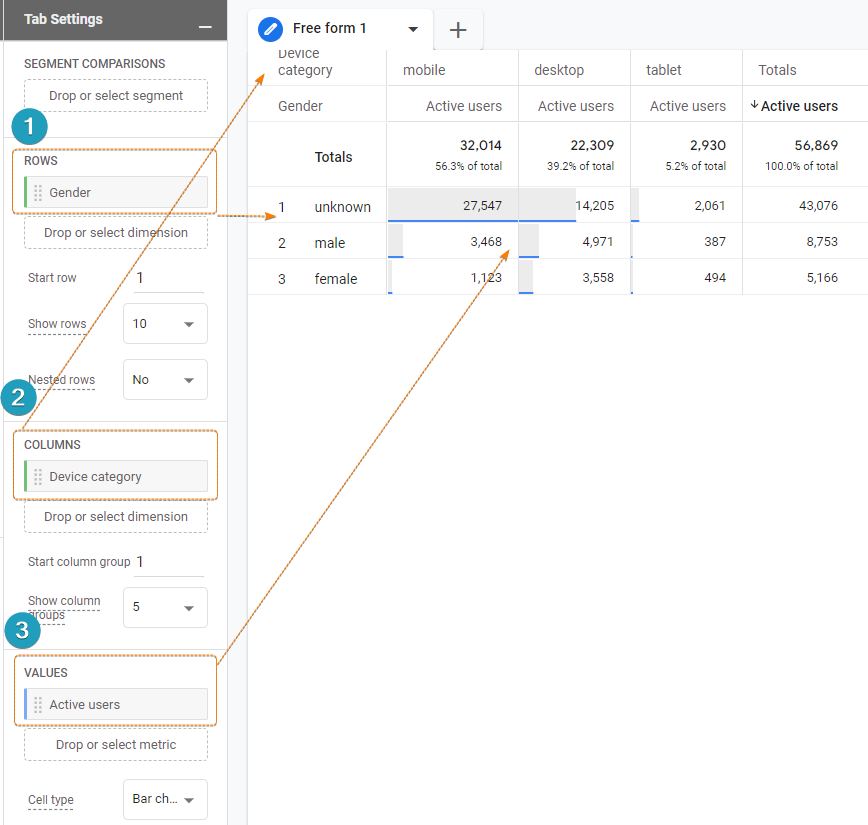
Rows, Columns, and Values
A combination of rows, columns, and values generates a data table. The rows and columns option shows up in the settings tab if the selected technique and visualization combination support it.
- Rows: organize dimensions vertically on a table.
- Columns: organize dimensions horizontally on a table.
- Values: Values populate the Metrics which add numbers to the grid made by rows & columns.
The use of these settings is straightforward. Rows and columns create a grid and values populate the metrics. It is handy to note that visualizations like Funnel exploration and segment overlap provide automatically generated data tables only( in addition to their main visualization), therefore, rows and column settings will not appear when you select these.
Filters
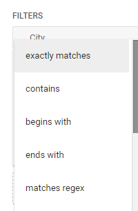
Filters settings appear at the end of the settings tab. Filters allow you to select a subset of data based on text-based pattern matches. You can filter on the basis of either a dimension or a metric.
Dimension filter: When you drop a dimension on the filter pane. It filters data with text-based pattern matches. E.g. contains, begins with, or regular expression matches.
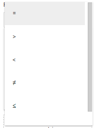
Metric Filter: When you drop a metric on the filter pane. It filters data with number-based pattern matches. E.g. equal to, greater than, less than, etc.
It is interesting to note that segments, also allow you to select a subset of data. But segments are used for comparisons mostly. Whereas filters create a data subset without comparing. Segments allow for more creativity in data selection via the segment builder, whereas filters can only create a data subset based on text or number-based pattern matches.
Visualizations in Explore
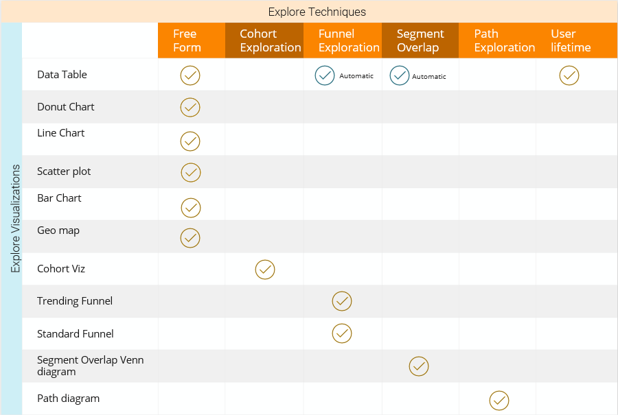
Visualization is where the data is presented to the analyst in a graphical or tabular form. Each technique has its own allowed visualizations. A quick glance at visualizations for each technique is given below. The table below lists all supported visualization vertically and all explore techniques horizontally. The tick sign indicates which visualizations can you see in each technique. Funnel exploration and segment overlap do not explicitly allow you to choose a table as a visualization. But they create tables automatically to describe the data.

The best way to understand what each visualization does within a technique is to read the diagram in the context of a business problem. In this article, I will keep it a high-level summary, however, under the analysis section of this blog, we will cover practical use cases to make data-driven decisions with these visualizations and techniques. Another good resource for practical business use cases is Google’s Mini guides for Explore.
Wrapping up
In this article, we unpacked the flexibility (and slight complexity) of GA4 Explore’s reporting by understanding 3 key sections of Variables, Tab Settings, and Tabs (space for visualizations).
Variables section helps in importing dimensions and metrics which we can use for reporting. Dimensions are ways to categorize and organize data points. Metrics, on the other hand, provide the numbers needed to understand the information categorized by the dimensions.
The Tab Settings section serves as a control center for the report, offering various parameters to adjust the output. Techniques are goal-based reporting tools. These include “Exploration,” “Funnel Analysis,” and “Cohort Analysis.”
The Visualization section is where the data is presented for analysis in either a graphical or tabular form. Each technique has its own set of allowed visualizations, with a table provided to indicate which visualizations can be used with each technique.

Responses